BRIEF//
Happy Dots is a Paediatric clinic located in Hunter Region, Australia. They offer fun Occupational Therapy for Children: Sensory & Play-Based Therapy. The owner of Happy Dots, invited me to re-fresh the brand and establish a unified graphic language across the digital and print space.
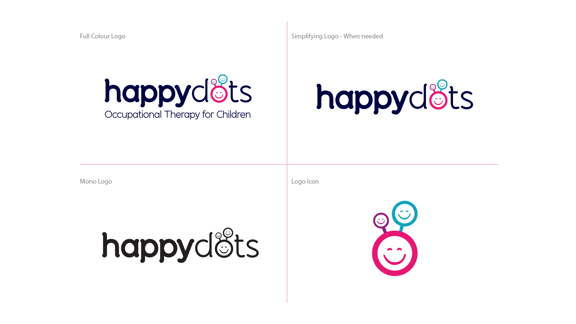
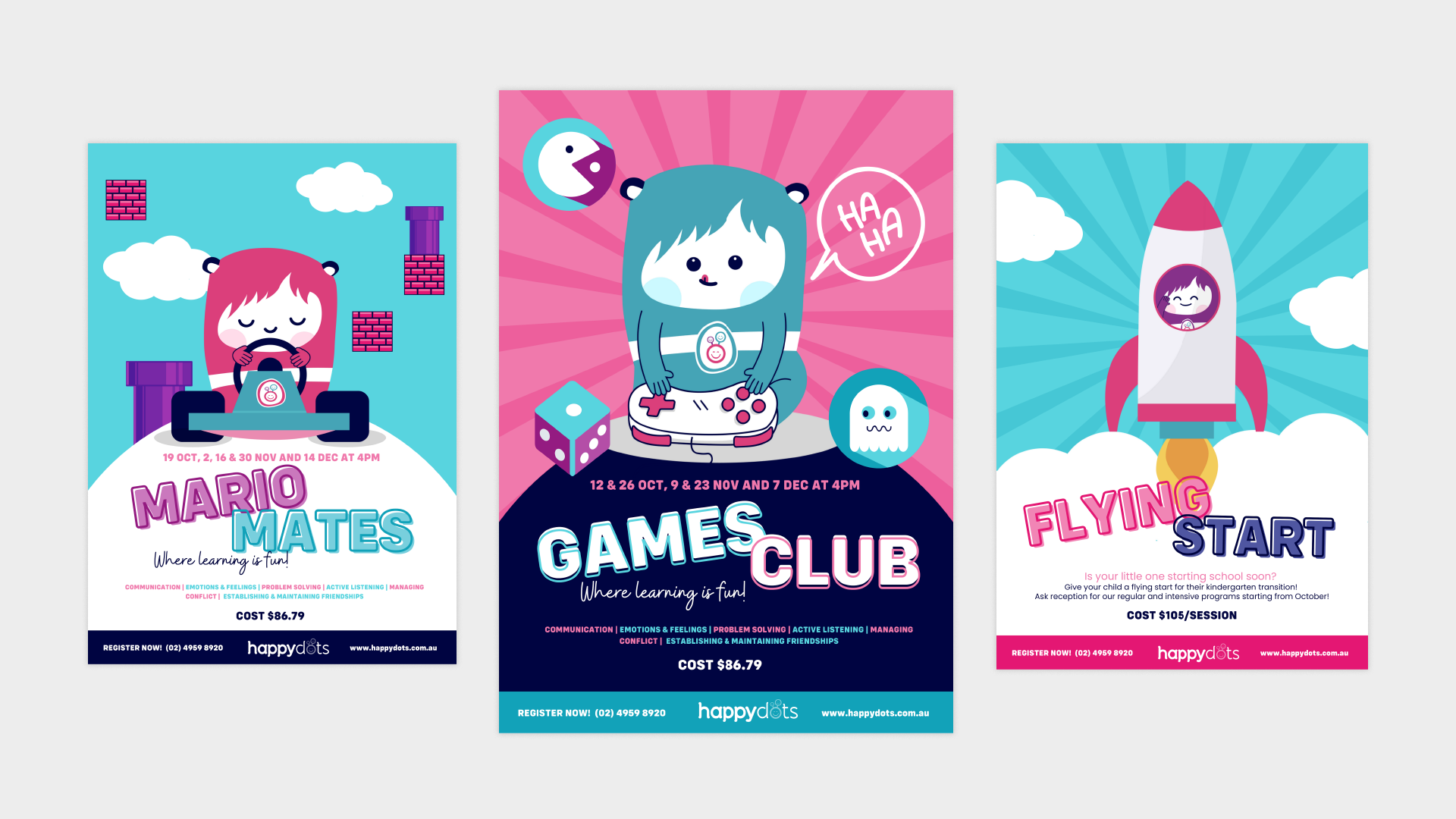
SOLUTION//
The brand was already known for its 3 mascots and unique brand in The Hunter Reason. The end result was to leave team at Happy Dots with a suit of Logos, print templates and themed mascots to use across their channels in house. The logo was tweaked and a brighter colour palette was introduced, the mascots were re-drawn in a more flat strategic approach allowed easy theming to be applied, and templates were created for easy updating.